223 | Double Edge

Beards-blog.png

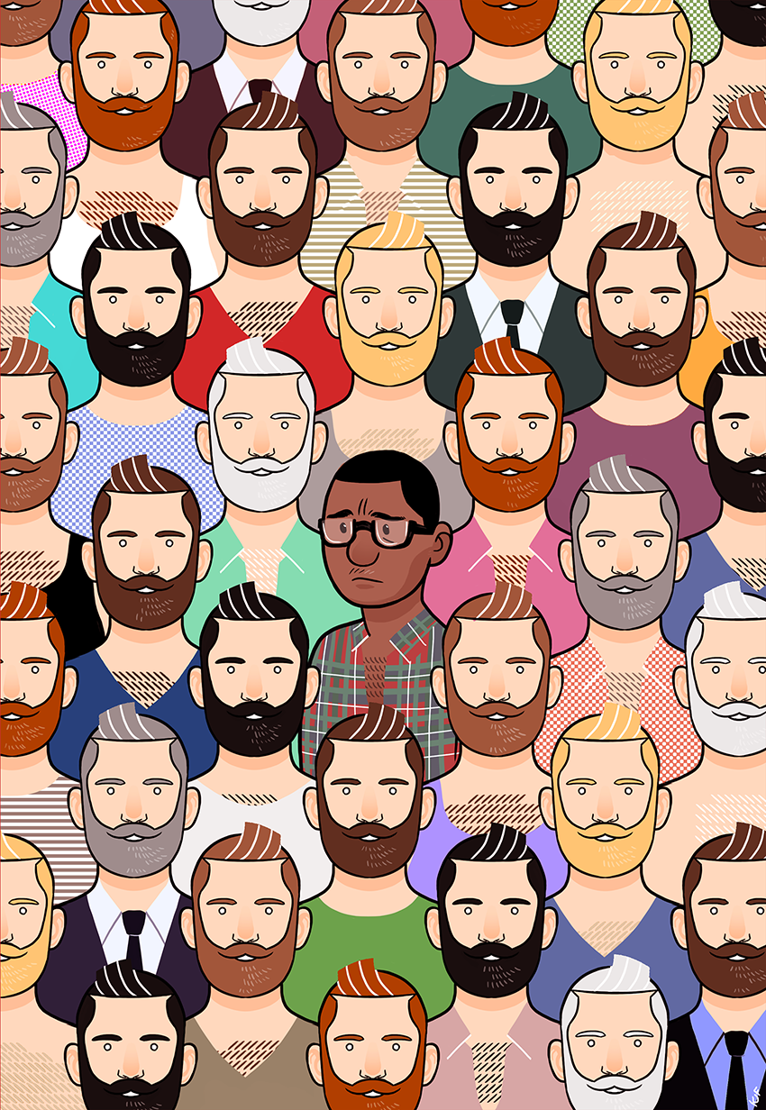
If you're here, You have definitely seen Same DIfference before : this drawing's the first thing you see when you enter my site, it's the banner of my facebook page, I've posted it several times on instagram... or you might have even seen it when I made it back in 2016. I joked that it would be the cover of my autobiography (that was totally not a joke). It was received pretty nicely, and I had many people talking to me about it. I no longer thought about it for a while and moved on.

Then, this Spring, after I'd only opened this site for a couple months, I noticed an unprecedented uptick in the number of visits. I had no idea why, especially since a lot of them were from the US, and most of my "fan-base" is in France and Canada (since that's where i've lived / live).

As it turns out, people had been sharing the artwork on Instagram and/or Facebook, and it had started going around. Most didn't credit me, but someone in one post's comments was nice enough to look me up and contact me so I found it out that way. The timing seemed to make sense.

Capture d’écran 2018-09-06 à 12.43.56.png

It was pretty flattering since the response was mostly positive (I'm mostly jealous that some who shared it got way more likes than I've ever had with my art, but that's social networks for you).

Capture d’écran 2018-09-06 à 12.38.47.png

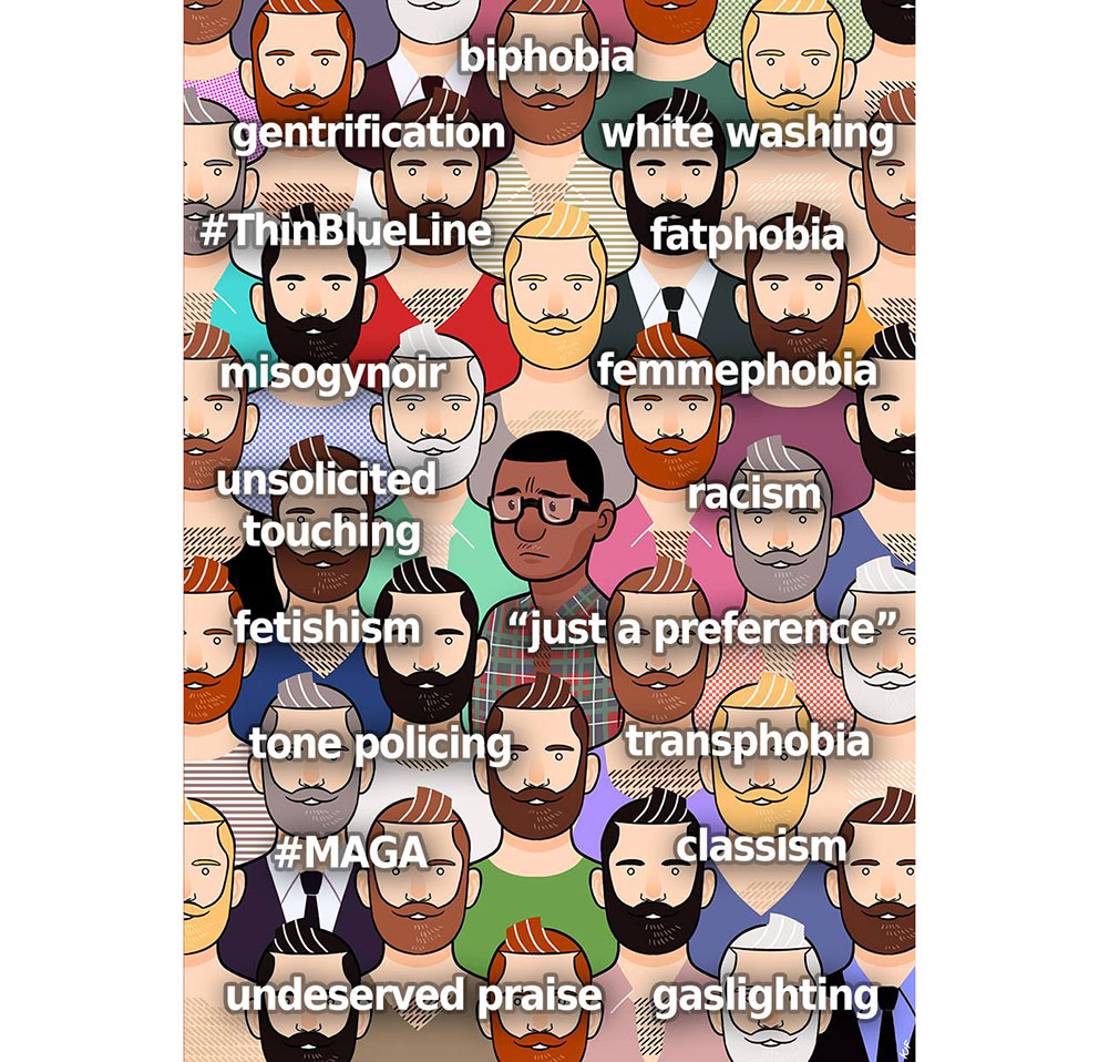
Soon, though, people started interpreting the artwork and giving it a narrative that I hadn't completely intended. Some used it to illustrate posts about racism and discrimination in the gay community, or its conformity, and that was OK, to a point :

Capture d’écran 2018-09-06 à 12.51.31.png
Capture d’écran 2018-09-06 à 12.52.45.png

That people interpreted the picture the way they wanted was ok, but I was starting to feel nervous that some (who had a lot more visibility with my art than I did myself) told others that their interpretation was what I truly meant. It eventually culminated with this image :

alex cooper webster.jpg

Obviously, I do not mind that people would use my art to denounce inequalities and injustice. I definitely agree that all of the issues here have to be addressed. And the person who made this, Alex Cooper Webster, was nice enough to credit me and even link to this site when he posted it, and to tell people who commented to also do so if they wanted to share it. I definitely thank him for that.

But truth be told, I was irked. Retouching someone's art without asking them is traditionally a big no-no (but, again, that's the internet for you). But more than that, because I am represented in the artwork, I felt uneasy about the re-appropriation that seems to make me say things that I didn't say - even though I agree with them, but that's not the point. It's commendable to want to use art to spread a message, but there's a difference between using a Picasso as a meme and modifying the piece of a barely known artist. Picasso has a legacy and integrity to his work that will perdure anyway, whatever you do to his work. That's not my case. It is possible that more people have seen this modified version of my art than the actual artwork I actually made. And even if it's mostly ego, it stings a little bit.

I've been thinking of a way to talk about my feelings on the subject, but i didn't want to seem insensitive or unappreciative. I am genuinely happy that something I've made has inspired people. It is very flattering, and I'm not used to it ; after all, my other artworks are mostly pulp so they don't warrant this kind of response.

I don't want to say what this piece is really about to me, because once an artwork has been shared, people find their own meanings in it, as they should, and have. I just wanted to say that it is a little hard to make sense of your own depiction of yourself and the expression of your thoughts no longer belonging to you once you let others see them.


But, that's just being an artist for you.


I do have to thank all those who shared it (and credited me), Webster included. Thanks to this visibility, I've had the pleasure of receiving messages and chatting with people who have told me how much this drawing means to them and shared with me their experiences as minorities within the gay community and elsewhere. I honestly never thought that so many people would relate to what is, without a doubt, my most introspective piece. I also never thought that any of my art would lead to such intimate conversations with strangers.

Finally, I really want to stress out that I care about the issues that people have used my art to denounce. Hell, I've experienced a lot of them first hand. But as a general rule, the best way to go about modifying someone's art will always be to ask the artist first - especially if they're a smaller scale artist like myself, who are easy to contact and will often be glad that what they're doing is reaching people.

In the end, I'm glad that something I've made actually means something and matters to someone. That's what should matter the most to me.

KJF

221 | The Christmas Three

A new artwork! I know it's been a while, and yes, I'm not dead. Lots of moving parts in my life these few months have prevented me from actively drawing much (for example, I've moved back from Montreal to Paris!), but it's gotten better and I'm back at it. There have been some new stuff uploaded on the comics site though, so go check it out if you want to see more of my universe or are just finding it out !

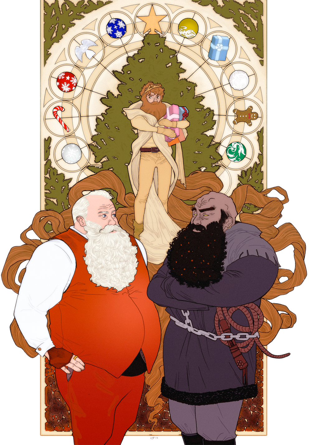
I've been wanting to draw a Christmas illustration basically since I've had the blog but it never seemed to work out quite as I wanted to. This is my fourth version of Santa (after this onethis horrible one and this sexy one). I'm pretty happy with this one though, with its little Art nouveau flair. The inclusion of my red-bearded Prince comes from a Christmas-themed short story idea that would involve him and other fairy-tale characters, but I mostly just wanted to draw him again as it had been a while (check out his latest adventures here).

Finally, the ogre character is a legendary European figure called "Père Fouettard", a less demonic equivalent of Krampus, whose role was to punish naughty children by, among other things, giving them coal as gifts. The depictions I've found of him made me uncomfortable (googling him opens a whole can of worms of blackface) so I drew my own ogre-bear-ish version.

220 | Strike !

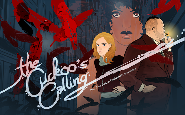
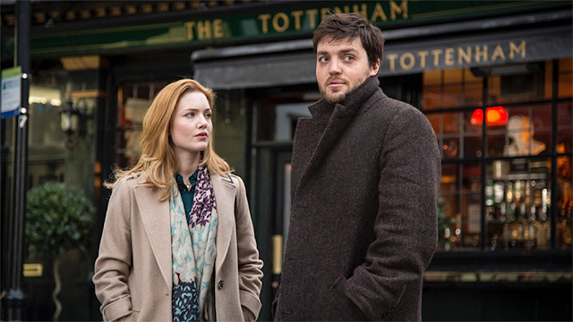
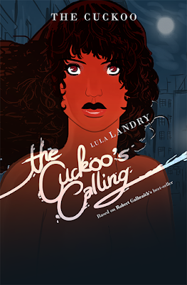
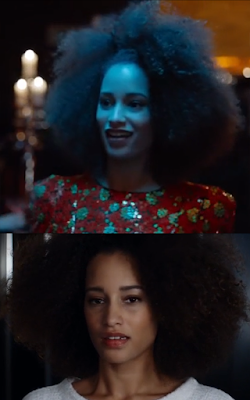
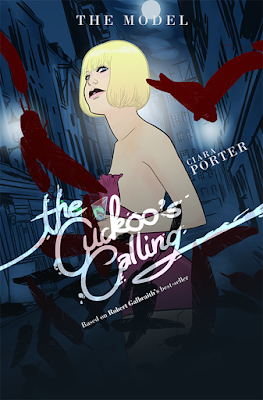
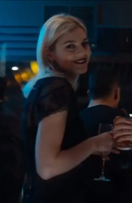
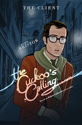
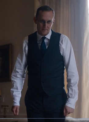
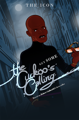
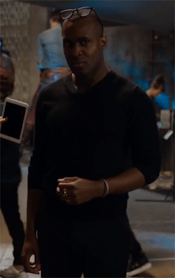
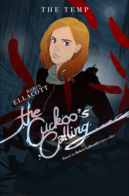
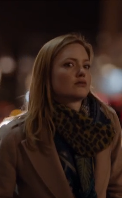
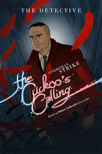
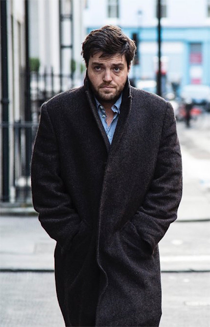
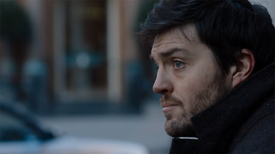
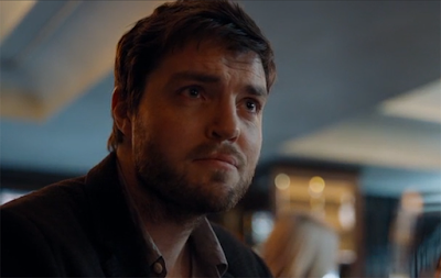
So, a couple years ago, you may remember I made a series of fan-art faux-movie posters based on Robert Galbraith (AKA J.K. Rowling)'s novel The Cuckoo's Calling. The first episodes of the BBC TV adaptation are finally out and they're the best thing I watched last Sunday! (what, Game of what ?). Just for some fun, here's a comparison of how I interpreted the characters and what they look like in the show !

I really like who they cast as the two main models of the story, Lula Landry and her friend Ciara Porter. Elarica Johnson is absolutely gorgeous IMO, though I pictured Lula a little more aloof and mysterious. Amber Anderson is also more radiant than my interpretation of Ciara, who I made look downright sinister. 

My idea of John Bristow matches the casting pretty well. However, their Guy Somé is a little too handsome in my opinion, to the point that I don't really believe him as the fashion icon described in the book (but I still have to see the third episode in which he plays a larger role so maybe Kadiff Kirwan will surprise me). I didn't draw Evan Duffield (because I hate him) but the actor they chose to portray him is EXACTLY the way I saw the character.

As for the two protagonists, I'm pretty satisfied with the casting. I pictured Emma Watson as Robin (my artwork is based on a picture of the Harry Potter actress), but Holliday Grainger captures the idea I had of the very capable Robin perfectly. She's immediately likable and relatable like in the book. As for Cormoran Strike, I do like the actor way better than when I first heard of his casting. I thought Tom Burke looked too young (the character is in his thirties, but Galbraith/Rowling made a point in repeating he looks older). I still do, and I also wished he was taller (Burke is my height so obviously I don't consider that very tall) and larger (fatter) like in the book. Still, he's handsome in a scruffy way that matches the character from the novel pretty well and he definitely captures the roguish charm and gruff demeanor I associate with Cormoran.

Now, do I like the show? I'm still on the fence. Having already read the story, it's entertaining to see how they've adapted it. There are a lot of early references to events that we don't learn about until the later books, which are fun.

Unfortunately, I think that if I wasn't familiar with the characters, I probably wouldn't have watched past the first episode. The characters are very likable, but the execution of the story and the direction are way too conventional for a story that is in itself already very conventional. There are sooooo many shots of Cormoran walking that I feel like the episodes would last half as long if you cut those scenes out. The whole enterprise doesn't have much personality either. It doesn't feel necesary as it doesn't add anything to the genre, instead looking like dozens of British detective shows that have come before. The novels at least had the very addictive J.K. Rowling's signature writing but Strike lacks a distinctive voice. A way more dynamic direction and/or a more eclectic score or original cinematography would definitely have been welcome, spicing up those episodes a little.

Still, on the basis of casting alone, it's a satisfying adaptation, so if you've liked the novels, you should still check it out. And if you haven't but like British detective shows and are not too demanding, it'll be right up your alley.

B-

219 | Same difference

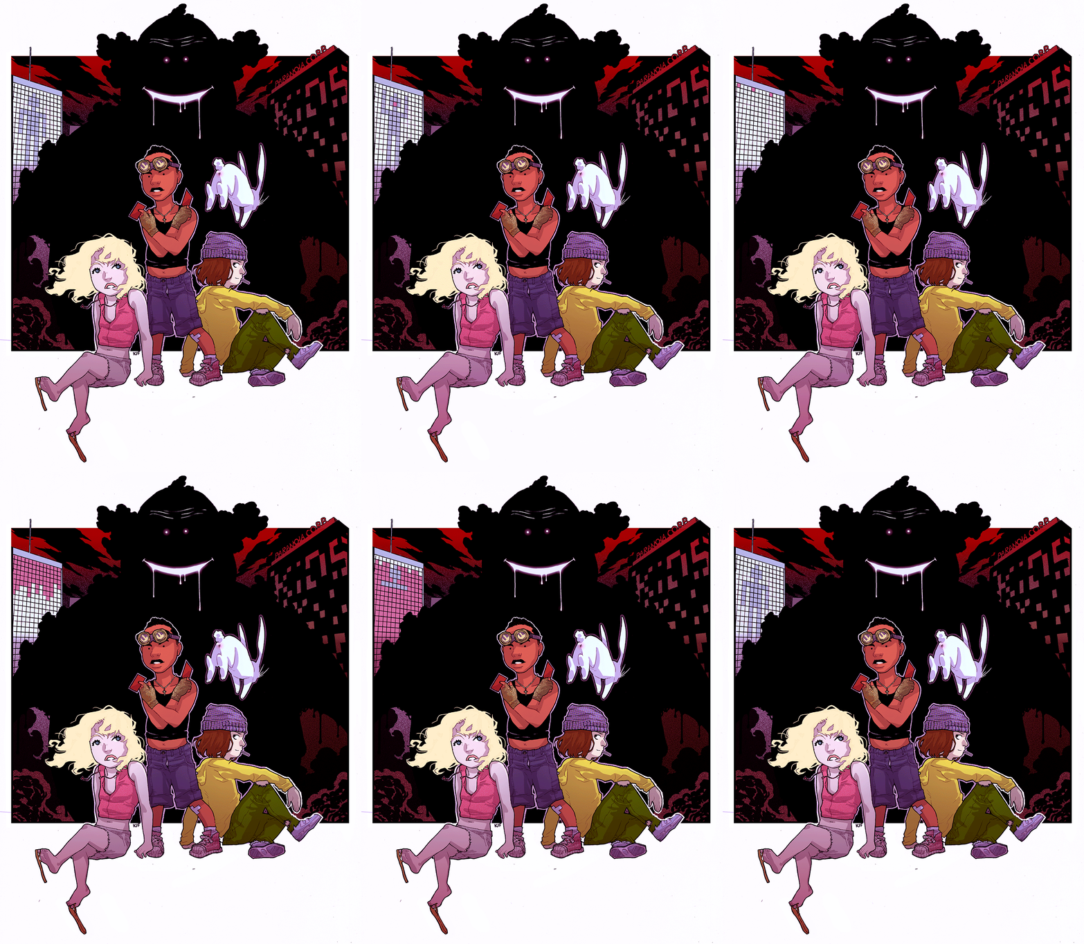
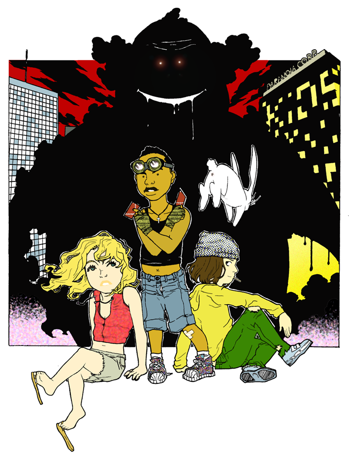
So, after a couple trials, and migrating to a new site that didn't quite work, I'm coming back to this blog. I haven't really posted anything on my personal sites in a while, choosing to instead invest in easier platforms like Instagram and Facebook, but I always kind of regretted abandoning all the work I had put in this blog for years, even if some of the early works looks amateurish. So I'm hosting two sites, this one for all my blogging ideas and artworks, and a second one on which I've republished every comic I've done since I started college and that I will update with new pages when possible.

218 | Seeing Blue

Collection-Drexciya.png

March 2018 update :

So, I wasn't quite satisfied with this artwork I made in 2016 so i decided to recolor it and here's the new version. For a little background info ; during my last college course, we discussed the topic of Afrofuturism (and I even drew a 20 pages comic as my last assignment). We read about the Drexciyan, which are, broadly, aquatic creatures born from the bodies of Black slaves who jumped off ship. Of course my artwork isn't as dramatic but this story was the starting point.

217 | Winter is coming

A poster of a little project I was planning a couple months ago about a Game of Thrones spoof. It's no longer happening but I like the visuals (I'd been using it as my phone wallpaper for a while).

Also, thanks so much to everyone who came to

Nocturnal Rhythm II

last Friday to see my exhibition and bought some posters and cards from the artworks on this site. It was a great experience and I can't wait to do something like that again !

210 | Le Café

If you look closely, you'll notice that most of the characters depicted in the "Collection" artworks are action heroes. Whether it's their ultra-dynamic position (like Bass ! Yeah ! Riff ! Boom) or a sense of danger and adventure surrounding them (like Jungle Gingers Explorers), they never seem to just stand still. So it was pretty refreshing, yet challenging, to draw something as low-key as this artwork, even if it's a quite simple one. In the beginning, I was only planning to draw the young couple but after I added the windows, I thought it would be a good idea to show their older selves (I guess it says something about me that my idea of improving an artwork is to show an happy couple splitting up).

Cette illustration est pas mal différente de ce que je fais d'habitude dans la Collection, qui présente en général des personnages ultra-dynamiques. C'était donc plutôt rafraîchissant, même si moins facile que prévu, de raconter cette histoire. Au départ, je n'avais prévu que de dessiner la rencontre du couple, à la terrasse de ce café, puis, après avoir dessiné les fenêtres pour décorer, ai trouvé plus intéressant de les utiliser pour montrer la suite. Pour être franc, je n'avais pas particulièrement l'intention de séparer le couple, mais c'était beaucoup plus facile à représenter vu qu'il y avait deux fenêtres, et finalement je trouve ça plus intéressant.

Tell me what you think while I start thinking about the next post !